(What is this? Check the lab notebook's table of contents)
Started 2024-11-11
Published 2024-11-18
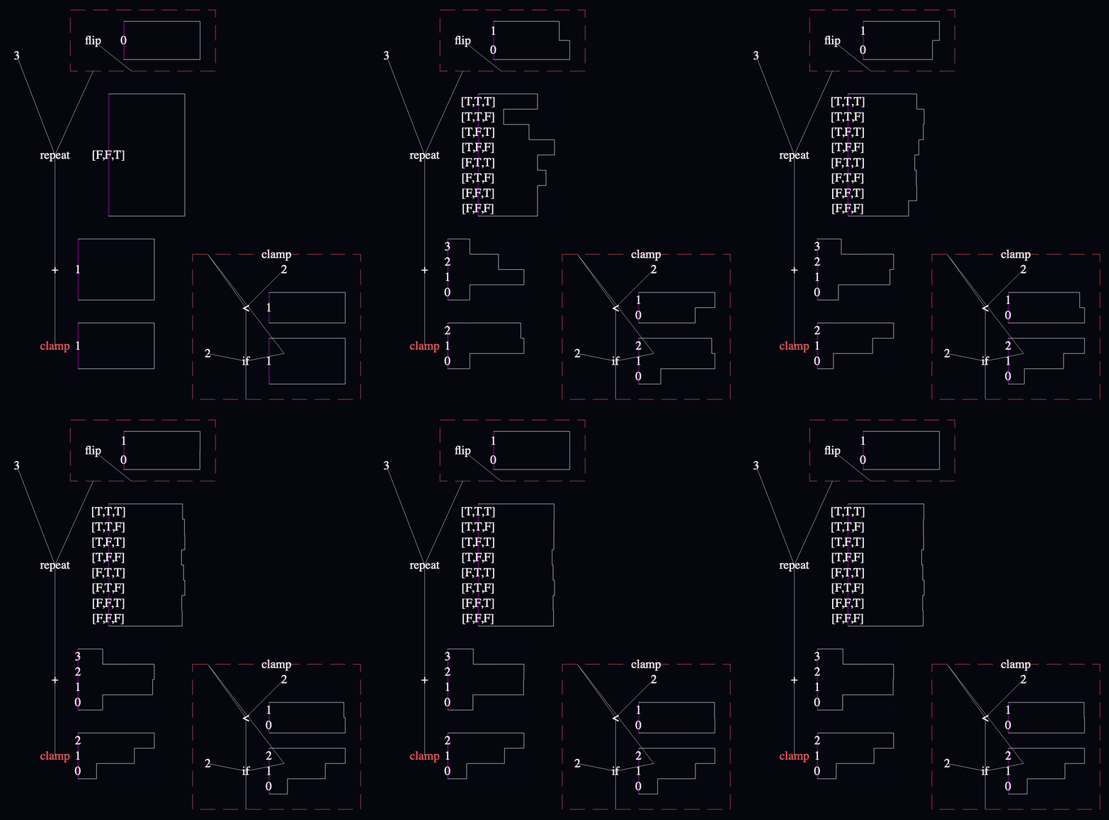
Let's check in. Models in my language look like this:

There's a lot I like, and a lot I don't like, but it turned out that, on balance, I came to dread making models with that notation. 😩 It was enough to extinguish the desire I had to work on this project for quite a while.
I never cooled on probabilistic programming, though. I had a ton of fun writing this in-depth explainer of one inference algorithm. I just put this project on the backburner while I thought of a way forward.
…
Eventually, I remembered schematic tables!
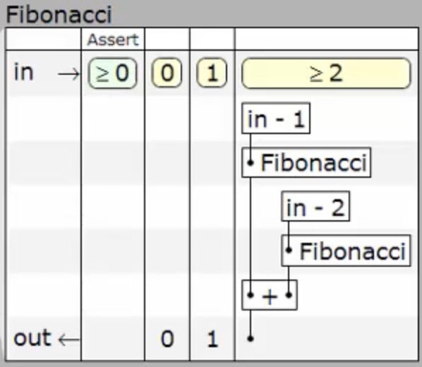
They cleverly constrain dataflow graphs to make data travel only vertically, so that the horizontal dimension can be dedicated to decision-making/conditionals.
If my readability problems lie with how little information the shapes of my models convey, then differentiating program branching and dataflow using X and Y axes like this might help.
My goal is to implement a schematic table visualization in my modeling environment, then use it to render all the example models I've collected so far to see how they feel:
I've thought a bit about how I'd like probability distributions to appear inline, but I expect these ideas to evolve once I'm working in software and pixels:

I would waste so much time twiddling pixel coordinates if I tried to lay these tables out by hand, so I implemented a recursive, constraint-based algorithm with familiar primitives like VStack/HStack, Padding, etc:

Every object participating in the layout system satisfies a simple, familiar interface:
type ProposedSize = {width?: number, height?: number};
type Size = {width: number, height: number};

interface Layoutable {
  root: THREE.Object3D;

  // “Given this much available space, how much would you use?”
  sizeThatFits(availableSize: ProposedSize): Size;

  // “Okay, you get this much space. Arrange your views.”
  layoutForSize(size: Size): void;
}
I ended up with structural Layoutables like EmptyView, VStack, HStack, Spacer, MaterialView, and wrappers FixedFrame, WithBackground, and Padding. This was enough.
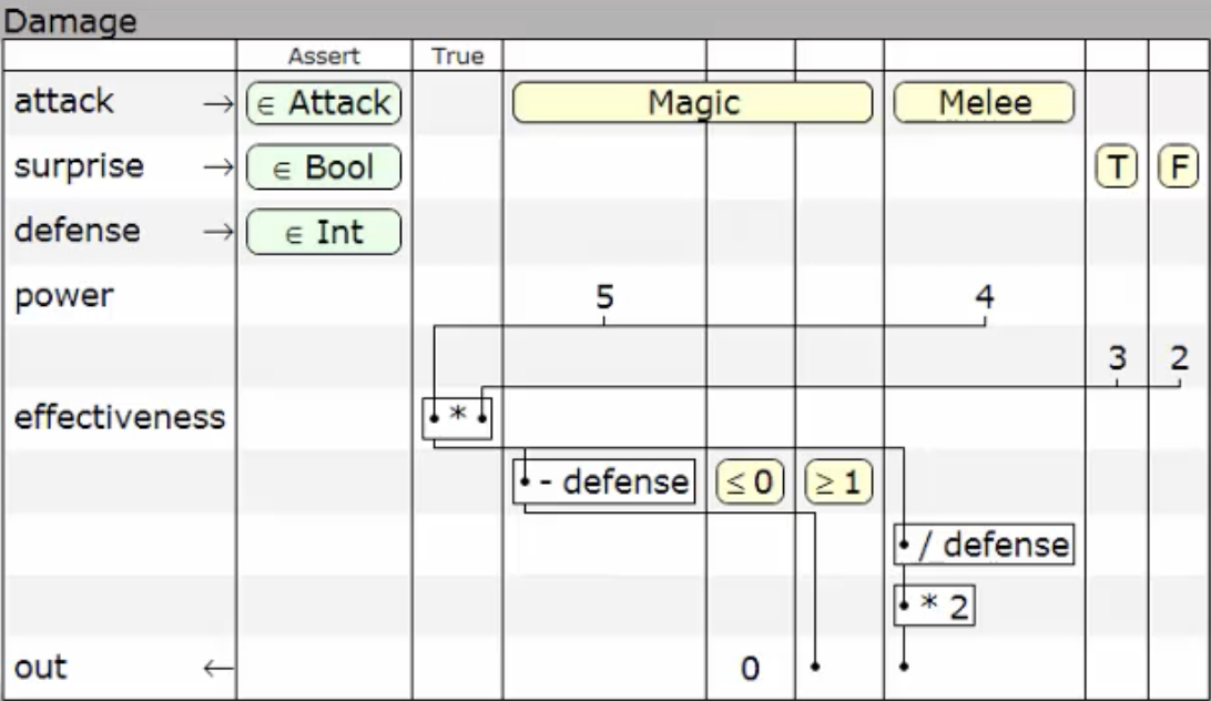
As a warm-up, I recreated Jonathan Edwards's damage calculation example. In this video, the table looks like this:
I actually got pretty close!
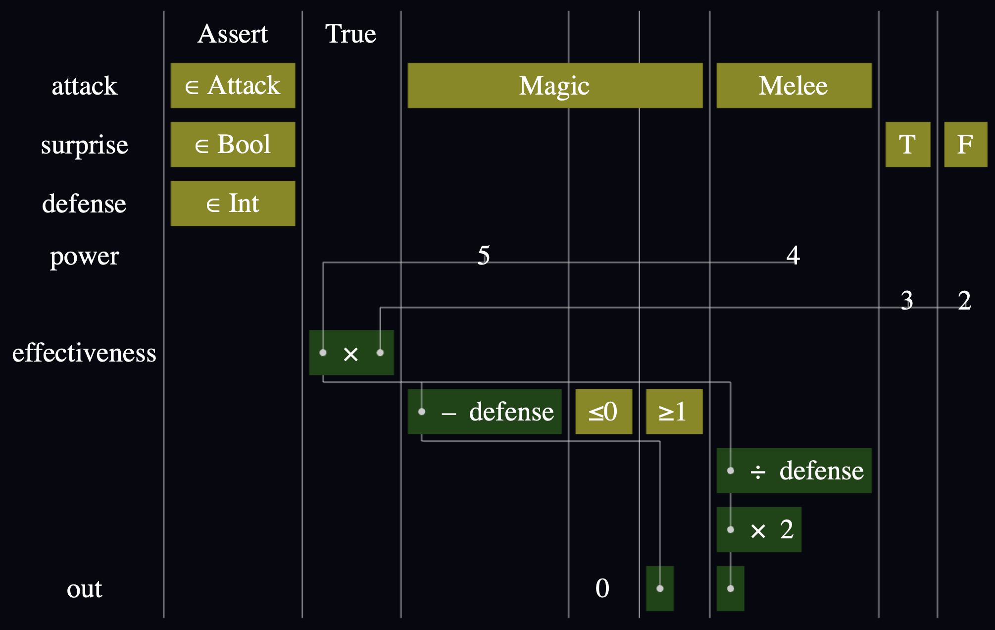
I didn't write this directly in terms of the Layoutables above, but I used them in all of the accessory views. The table is a new Layoutable for rendering a grid, that sizes each row and column based on the max() of the widths and heights of the views they contain.
The wires are drawn in a separate pass, using the world coordinates of the anchor Object3Ds post-layoutForSize.
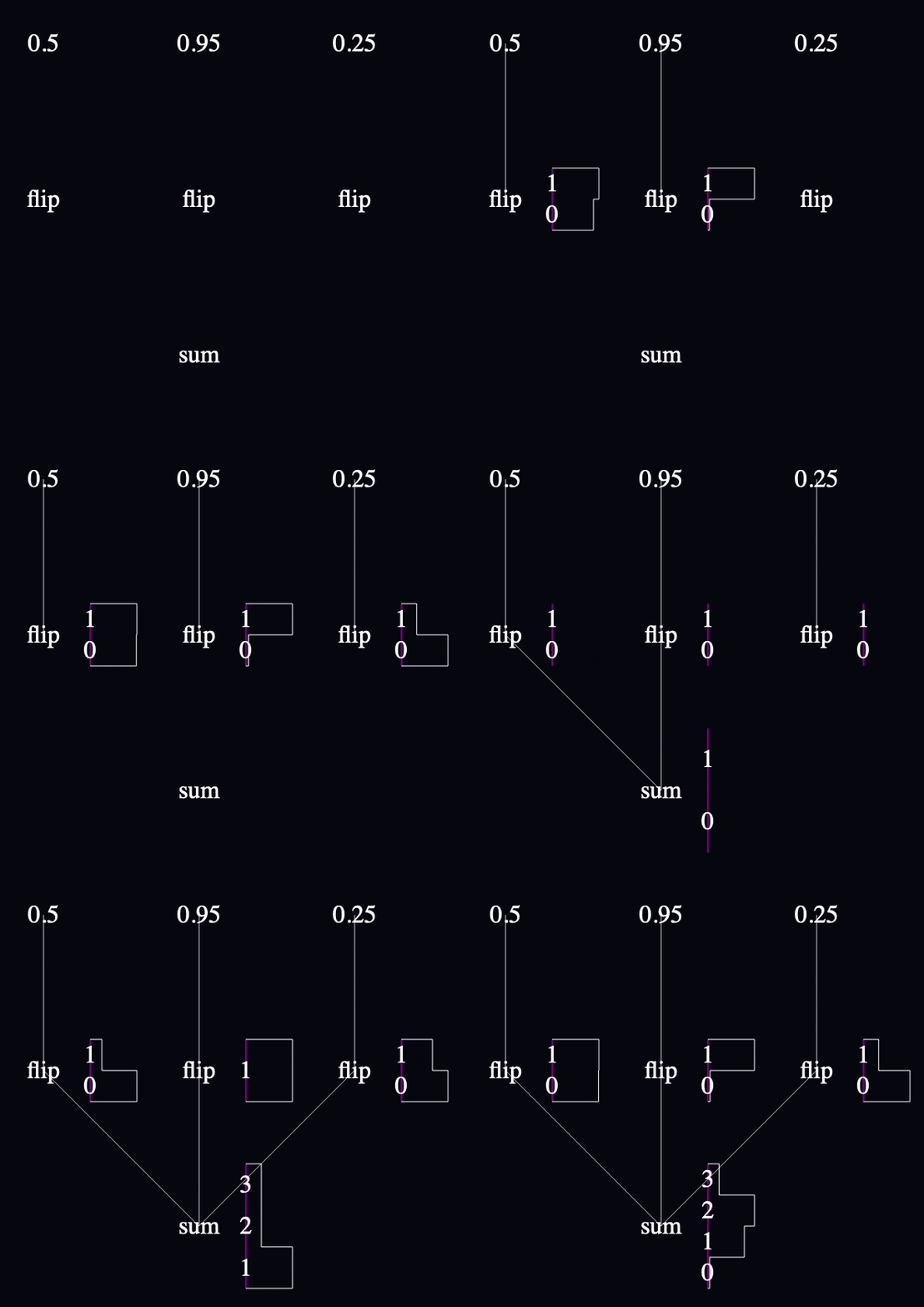
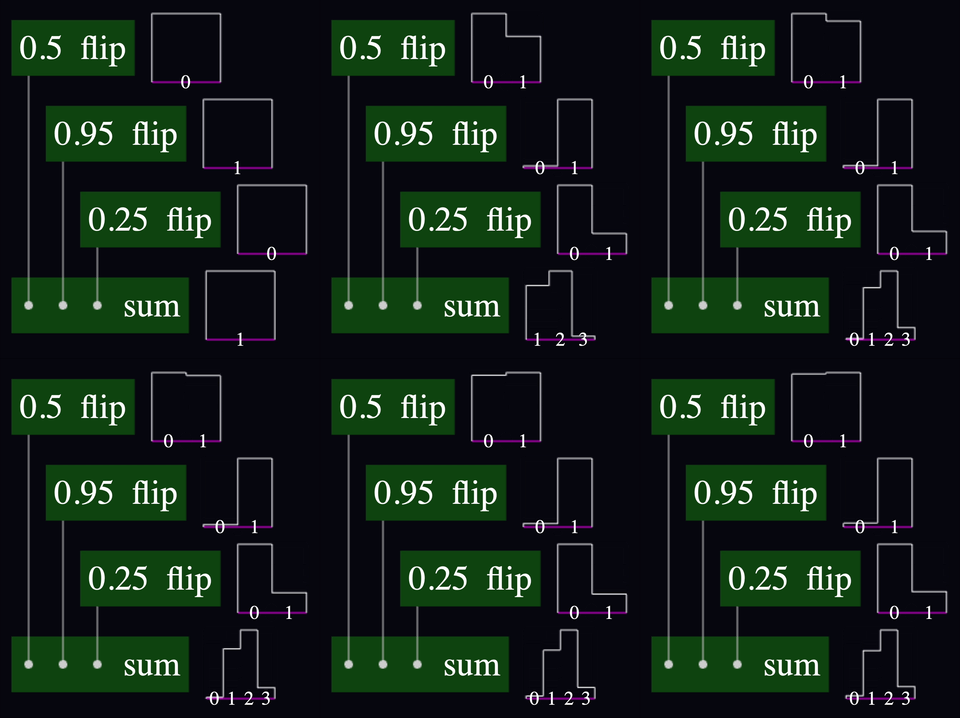
This model counts the number of heads you get if you flip three biased coins.
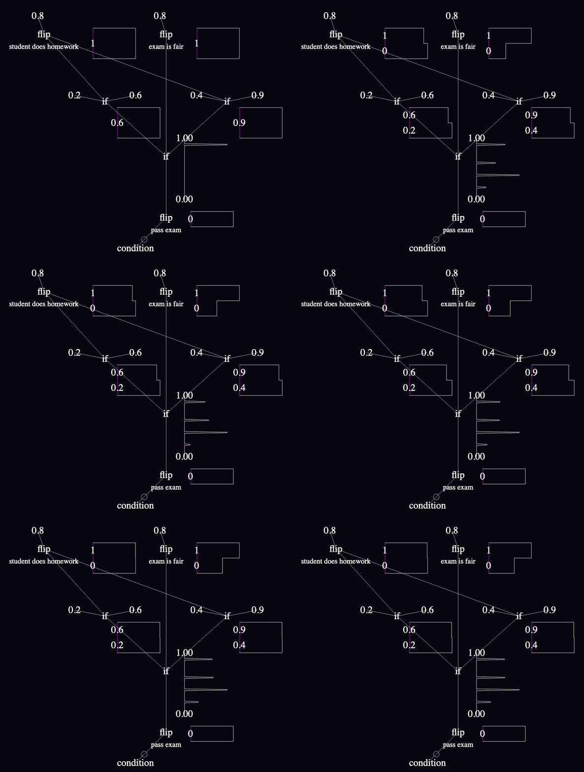
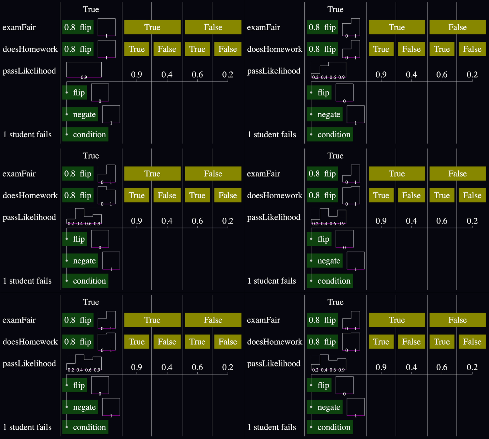
Before and after:
This model has prior likelihoods of an exam being fair and of a student studying, and updates them based on the outcome of a single student failing.
I had planned to port the tug-of-war and function-calling models, too, but honestly, I'd seen enough.
Schematic tables are an incontrovertibly better representation for these models than what I had before. The results speak for themselves!
The layout library makes it easy to create these tables, too. Every time I was unhappy with the way something looked, I could fix it with a few Spacers or Paddings. As with previous prototypes, this is a visualization, and not directly editable, so I don't have a signal yet about whether it's good for that.
And finally, I'm very pleased with the affordance for inline charts. I see tons of options.
Schematic tables will be my starting point for visualizations going forward. I'm psyched!