(What is this? Check the lab notebook's table of contents)
Created 2024-02-17
Published 2024-02-18
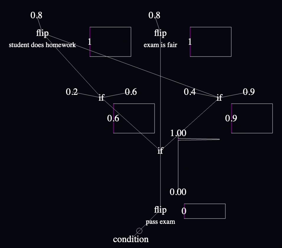
I decided in Entry 003 to work on conditionals next, since they're the next-simplest language feature required for ProbMod's trait attribution example model, fair exam vs does homework:
Infer(function() {
  var examFair = flip(.8)
  var doesHomework = flip(.8)
  var pass = flip(examFair ?
                  (doesHomework ? 0.9 : 0.4) :
                  (doesHomework ? 0.6 : 0.2))
  condition(!pass)
  return {doesHomework: doesHomework, examFair: examFair}
})
I will not noodle on how conditionals work yet. The real goal is to test interactivity via model-editing, and I'm only adding the bare minimum new language features required to write models that are interesting to edit. I will add conditionals, they will be bad, but they will be simple to implement, which will allow me to play with interesting models faster.
I will implement an "if" node to support conditional values:
I won't render inputs or outputs differently in any way, for simplicity of implementation. I will endeavor to follow the convention I've held so far of data generally flowing from top to bottom, and I'll start a new convention that the if-false value enters from the left and the if-true value enters from the right.
Since the language has no side-effects, I will evaluate both sides of every conditional always, again for simplicity of implementation. The only effect this will have is that the charts for both sides will contain samples even from traces when their values were thrown out. I don't know how much this will matter to correctness yet—I guess it depends what someone wants to get out of the charts. Let's say it's part of the experiment.
As a reminder: at this stage of the project, the visuals are not connected to the running code in any way except that the charts are hooked up to real data. The visual representation is meant to be theoretically executable but I'm not bothering to interpret it as code yet.
As in the last experiment, I deleted almost everything in main.ts and recreated it from parts today (Node here, Wire there, PDFBarChart over there, etc). All of those classes got slight upgrades along the way, but I accidentally went above and beyond:
I don't think that's unreasonable. The first one was for legibility, which it turns out, the language direly needs:
The priors in the model (assumptions about the universe) are that exams are 80% likely to be fair, students are 80% likely to have studied, and the likelihood of passing is 20% if the exam is fair and a student didn't study, 90% if the exam is fair and a student did study, etc. You can read all this from the static parts of the code graph.
The way that this model settles indicates (via the charts next to "student does homework" and other labeled nodes) that if all you know is that one person took an exam and failed (implemented by the negated "condition" in the lower left), then the likelihood that they studied is only about 50% (down from the prior that 80% of students study), and the exam is still more likley to be fair than not.
The intermediate value chart with the most interesting data is the probability distribution for passing the exam near the end, that combines the probabilities coming in from both sides and their corresponding weights based on how often they're sampled. It's difficult for me to summarize what it shows in words, but it's a chart that repeatedly captivated me as I played with various parts of the model during development because it was a nice summary of the logic above it. It reflects the skew of the likelihood of passing, which is bottom-heavy, but not to the extent that I might have guessed based on the fact that it reflects only the samples that ended in failure.
At first I centered node labels just above the node names, but I moved them below since that seemed to fit with the top-to-bottom dataflow direction. Being centered pushes the chart too far to the right in my opinion, and if I ever get around to it, I think I want to align the right edge of the annotation with the right edge of the name of the node.
"if" is pretty easy to read when all its inputs are nearby, but I'm already struggling in this tiny model to read them when their inputs are far apart. This is going to be a big deal. I might want to add annotations to the wires at the point where they connect into a node or something.
The left/right convention for "if" inputs bit me a few times. I think I accidentally put the if-true value on the left and if-false on the right for every single conditional the first time through, because I was tiredly copying values from the WebPPL code above where the conditionals are written with ternary syntax and the if-true value comes first. I only caught them when I was reading the charts and the distributions of values didn't make sense—which was something to celebrate since those charts are the main reason I thought that this language needed to exist, though it's obvious that I need to ditch this "if" syntax at the first opportunity.
Random feature ideas that occurred to me as I was building and playing with this prototype:
This result is just a stepping stone.
For one, it's not the full trait attribution simulation. It only supports a single observation because that's all you can easily do without the ability to define functions. If I already had the ability to edit the graph, I might go through the effort to copy/paste the relevant nodes a few times to simulate more students, but the code is still in a state where I'm copy/pasting Three.js commands and manually editing pixel coordinates, so I haven't felt like it.
For another, the language is only incrementally more expressive with "if" and "condition". Without functions, it's still very limiting. All the fun examples define functions and often include memoization.
I'm pleased with how well the inline charts have continued to scale with the model. I cannot wait to be able to see them change immediately with model changes. I almost introduced a little input handling to toggle the "condition" and slide values up and down—but managed to stop myself.
It's jarring how ill-suited "if" is for the way it's used in this program. A conditional probability table would be better. A decision table would be better. A flowchart might actually be better. But this was easier than all of them. C'est la vie.
I'm not sure if the reason I'm able to edit it easily is because I've also seen it as text.
I wish I'd been pleasantly surprised by the way "if" worked out, but it's not the worst, I achieved the goal of being able to express more models, so it's time to move on.