(What is this? Check the lab notebook's table of contents)
Started 2024-11-19
Published 2024-11-23
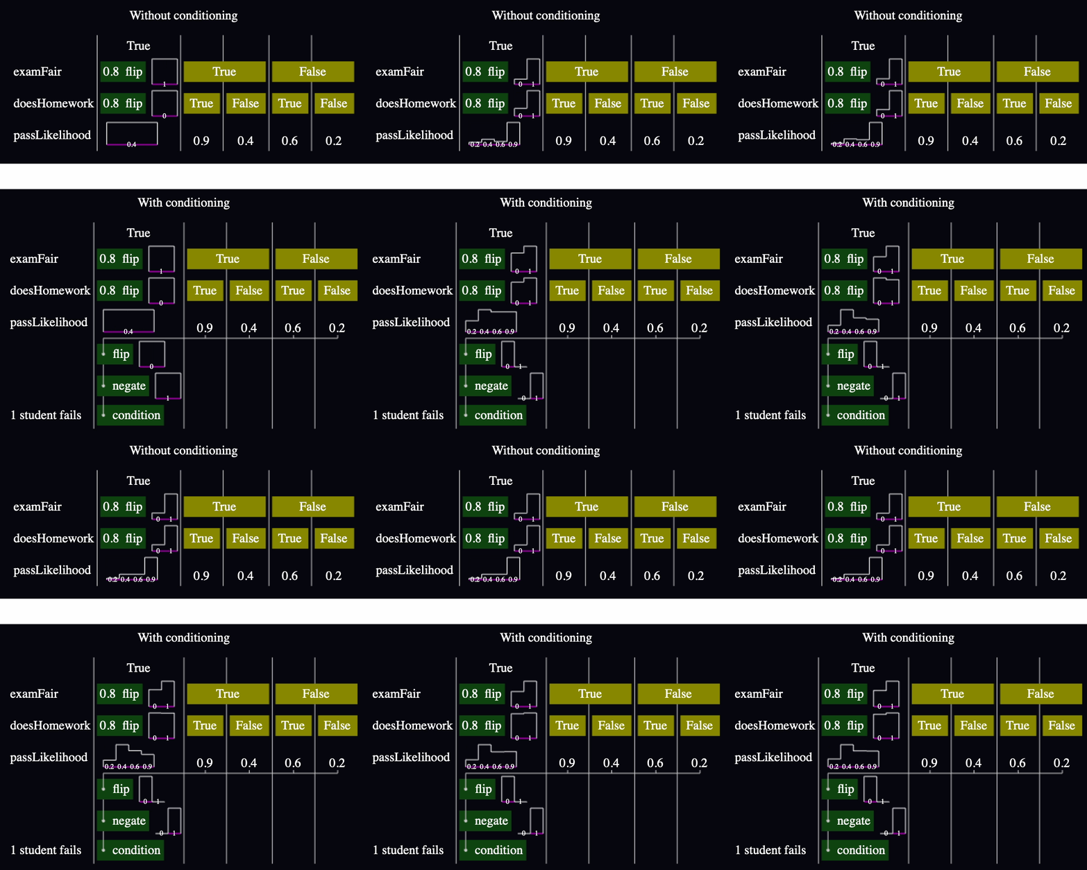
Most of my models so far have two parts: the causal model and its conditioning. Take this example from Entry 007, modified so you can see what I mean by "conditioning":

The first half runs a simulation. In this case, it simulates the creation of an exam that's either fair or not, then the existence of a student that either does their homework or not, then decides the likelihood of that student passing that exam. This is a theory of how the world could work, in executable form.
But the conditioning is what makes the model useful for inference. In this case, condition throws out all the simulations where that student passes. The result is a change in the likelihood that the exam was fair and that the student did their homework. You can see it in the charts in the model with and without conditioning: without conditioning, examFair reflects the model's prior that there's an 80% chance that the exam was fair, but that reduces to only about 60% with conditioning. Similarly, the likelihood that the student did homework decreased from about 80% to about 50%.
The purpose of this experiment is to find a way to see all that with only one chart.
Explore various ways of modifying the inline charts to show probability distributions before and after conditioning.
For now, I'm not considering options that would require me to interact with the model, like clicking on stuff.
The height of each bar is based on how many times we ran the model and observed that value. Previously, condition(false) was basically throw new ConditionFailed() and I wouldn't log any sample for that run.
Now, I log every sample with its associated likelihood. Now if I make a chart with all the samples, then I get the unconditioned data, and if I weigh the samples proportional to their likelihood, I get the conditioned data. Great.
The first thing I tried was overlaying two bar charts. But it was hard to convey "before and after". They just looked like two sets of bars that I had to reinterpret every time. (I accidentally deleted the code before taking a screenshot. 🤦🏽♂️)
I reverted to a single set of bars showing the conditioned data. Then I added a little flag to connect the bar to where the unconditioned bar would be:
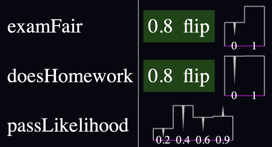
This was better, but I noticed two problems:
The flags looked like arrows, but interpreted that way, they were pointing in the wrong direction. They should point from the unconditioned data to the conditioned data.
It was hard to translate the information from the flags out of the chart. I realized it was because of the scaling. I'd normalized to make the tallest bar have 100% height, but if a bar was tallest with and without conditioning, it wouldn't have a flag and that made it look like it was unaffected by the conditioning.
So I flipped the flags upside down, and normalized the bar heights so that they stack to 100% height instead:
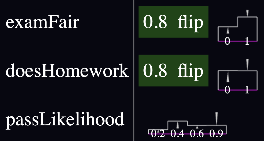
Pros:
Cons:
Anyway, check out the final result!
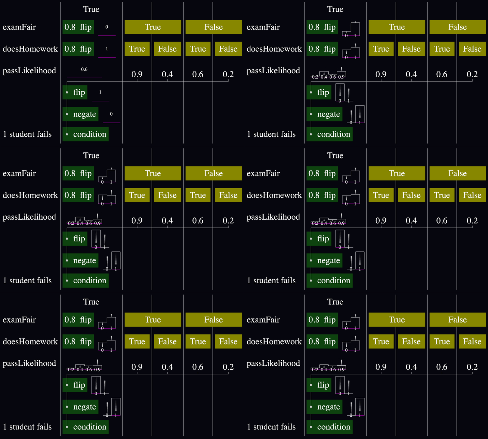
I'm satisfied. This allows me to answer questions like, "If I observe one student fail a test, how does that affect the prior likelihood that the exam was fair? Or that they studied?" And I can do it all without clicking. 🙌🏼
Onward!