I spoke with one of my advisors today about not being quite sure about where to go next with my research. Context: I just submitted a paper to CHI 2013 about always-on programming visualizations (featuring Theseus) and the user studies I ran on grad students and professional JavaScript developers.
One advisor's suggestion was to write about each of the ideas I was working on to help clear my thoughts. I'll start with data probes.
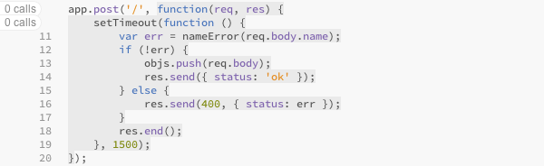
Theseus currently shows you how many times code has executed, and colors unexecuted gray to make it appear dead:
I wanted to do something similar for the data passing through those functions, so I created the prototype shown below. It displays the most recent value of the outer-most expression on each line just to the right of that line. If the outer-most expression is a function call, it also shows the values of the arguments.
I see several problems with the design:
I think that before I decide on a design I need to watch more programmers to develop some concrete use cases, as I did for Theseus’s call count features.
When I brought up the concern about noise in a group meeting, a lab mate suggested that I don't reveal much information by default and give the user some simple gesture to reveal the rest. The metaphor is peeking. To me that implies a continuous gesture because the information shouldn't just pop in, especially since it will probably involve moving some of the code around. I've been considering a few different means:
The traditional gesture would be to press a hot key that toggles the display with a fluid animation― but these are more fun to think about, especially the last one, which I don't think has been tried before.
I'd been meaning to research visual clutter and distraction with regards to programming visualizations and recently my advisor sent me a link to an article called "Taking a New Look at Subway Map Design". It alludes to a computational model of what people perceive in their periphery. That led me to Rosenholtz's publication page, which I am working my way through now. There's a lot of fascinating stuff here.
I need to run some errands soon, so I'm going to plop my reading list here and fill it in with notes as I go.
"Roles of Variables" is a system for describing what variables in a program are for, so that novices can more easily chunk code:
http://www.cs.joensuu.fi/~saja/var_roles/
For example, i in a loop is a "stepper" and prevNode in a linked list algorithm is a "follower". They provide a list of 10 roles that they think are sufficient for 99% of the programs novices will write.
It seems to fall into several categories of research I like:
They mention that Roles of Variables would help even experts to understand code, but I haven't read the literature to understand how.
A co-researcher and I did an exercise: I pasted some code into a Google Doc and we added comments on each line with visualizations that would be helpful for understanding what that line of code was for. They all fell into a handful of categories (though if we did this seriously I'm sure we'd find many more):
Often, several of those types of information applied to the same line, though often there was one type of information that seemed most appropriate in a given instance. For example, documentation might be appropriate for a call like arr.slice() since the function is supposed to take an argument and there isn't one, but alerting the programmer to the fact that arr is an empty array might be more important.
That suggests to me that instead of trying to think of the thing to visualize (as I was earlier this month), I might want to think about how to support choosing the most appropriate information to display when there are several alternatives.
My instinct tells me that it's a global optimization problem. There are several things I could display next to every line of code, and several sizes I could display them at, and my job is to choose the “best” combination of choices for the user's current task.
A cool way to reveal intermediate values with a continuous gesture would be to slide the sub-expressions up level-by-level:
|
→ |
|
→ |
|
||||||||||||||||||
It seems to work well with function calls, too:
|
→ |
|
→ |
|
→ |
|
||||||||||||||||||||||||||||||||||||||||||||||||||
Though, come to think of it, the leaves should probably be revealed first. Current debugging tools usually support viewing those values (and no others), so they're probably what people care about most often.
I've been trying to figure out how to allow programmers to limit their queries in time.
A convenient delineation for JavaScript is the tick. A tick is one call into JavaScript from the VM's event loop. Every tick has an impetus, such as data coming in from the network or a timeout occurring. Usually the impetus is something the programmer cares about, which makes it convenient for visualization.
In general, I don't like the timelines in debuggers because they take up so much space and yet the events are so tiny and abstract that they're hard to relate back to code. Then I thought, why not overlay the timeline on the code:
This is a time-varying code coverage display.
The mock-up was created as a quick way of getting ideas onto pixels, so it's not entirely coherent. The basic idea, though, is to represent ticks along the bottom of the screen (added in real-time, of course), with vertical bars stretching from them into the background of the code. Where the bars intersect code that executed on that tick, they are colored (currently, in gray, which I think is a bad choice).
There are some obvious extensions, such as showing the number of calls/iterations in the bars, coalescing ticks with no appreciable time between them (such as when process.nextTick() is used), showing which branches were taken, showing where exceptions occurred, etc.
This visualization gives you a way to select regions of time such as those listed earlier (the thing that happened just now, etc.). That lets you filter things like log output and floating code tips.
VM ticks are only one convenient granularity by which to split up the time axis. You could also use application events, such as those generated by jQuery, EventEmitter, or Backbone.js. The problem there is that events can nest, which complicates the visualization. I suppose the VM ticks are nested too, though, if you consider the causal chain that resulted in the tick occurring. But VM ticks have definite ends, whereas I don't think it's reasonable to say that the call graph of one event handler ends where the call graph of another event handler begins if they're connected by synchronous invocations.
This works in the code → execution time direction, but if you want to see all the code that executed for a given tick, another interface is necessary. Perhaps one that concatenates the sources of all the functions that executed. I've wanted to try to do this with split editors for a while*.
(I'm writing this while on the verge of consciousness. I hope it makes sense.)